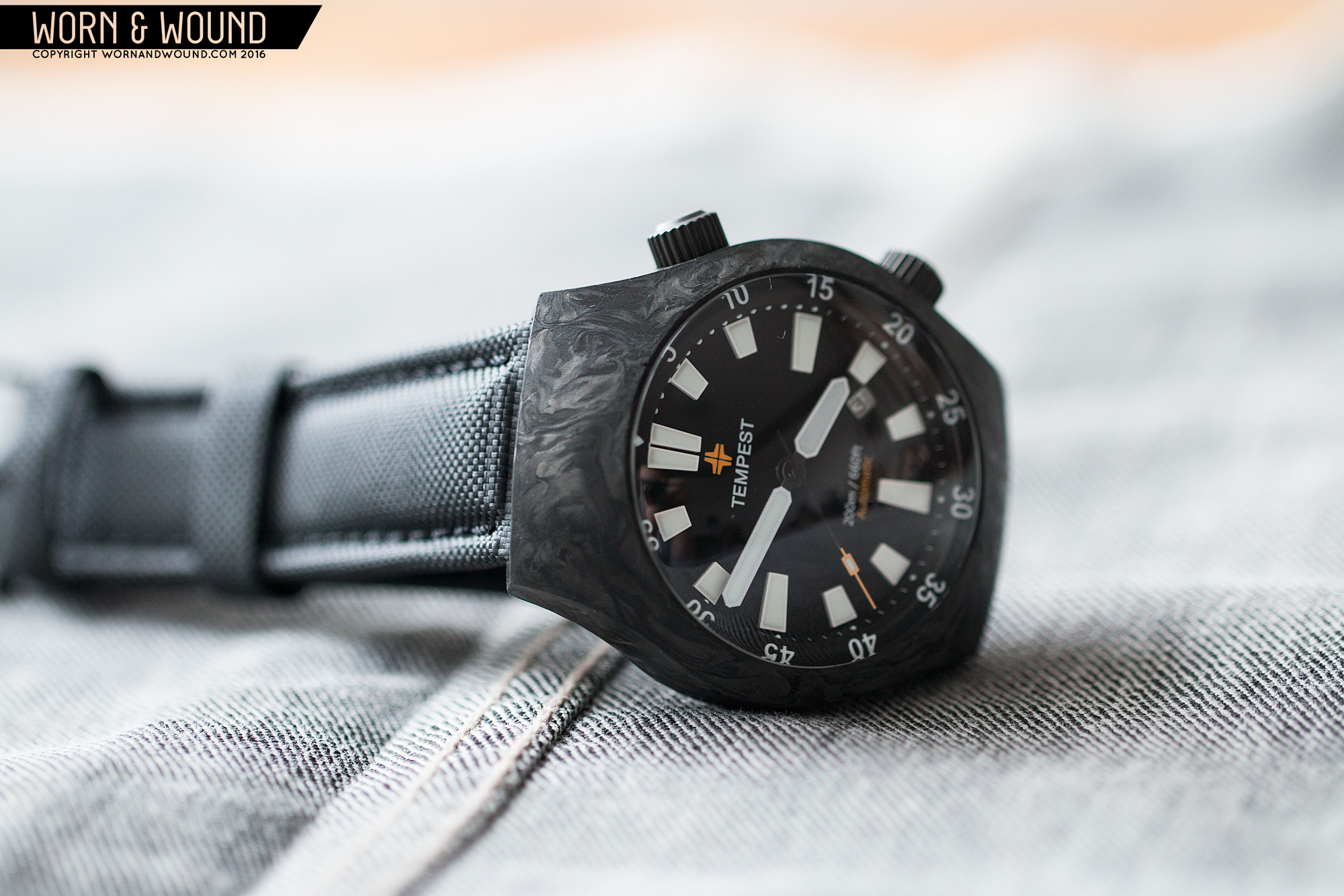
As you can read in my review, the Carbon 1 was a success. It was fun, unique, attractive, and brought this material into the realm of obtainability. Now, a little over a year and a half later, Tempest is following up on that watch with a new design, aptly titled the Carbon 2. The design draws on the first, but takes things into a different, perhaps weirder direction. Following clearly in the footsteps of the first, the Carbon 2 takes the platform and adds an internal bezel, giving it added functionality for divers and in general.Still boasting a gorgeous carbon case, huge domed sapphire crystal, 200m WR and a Miyota 9015 automatic movement,and is one of the more exotic looking timepieces we’ve come across.
Dial
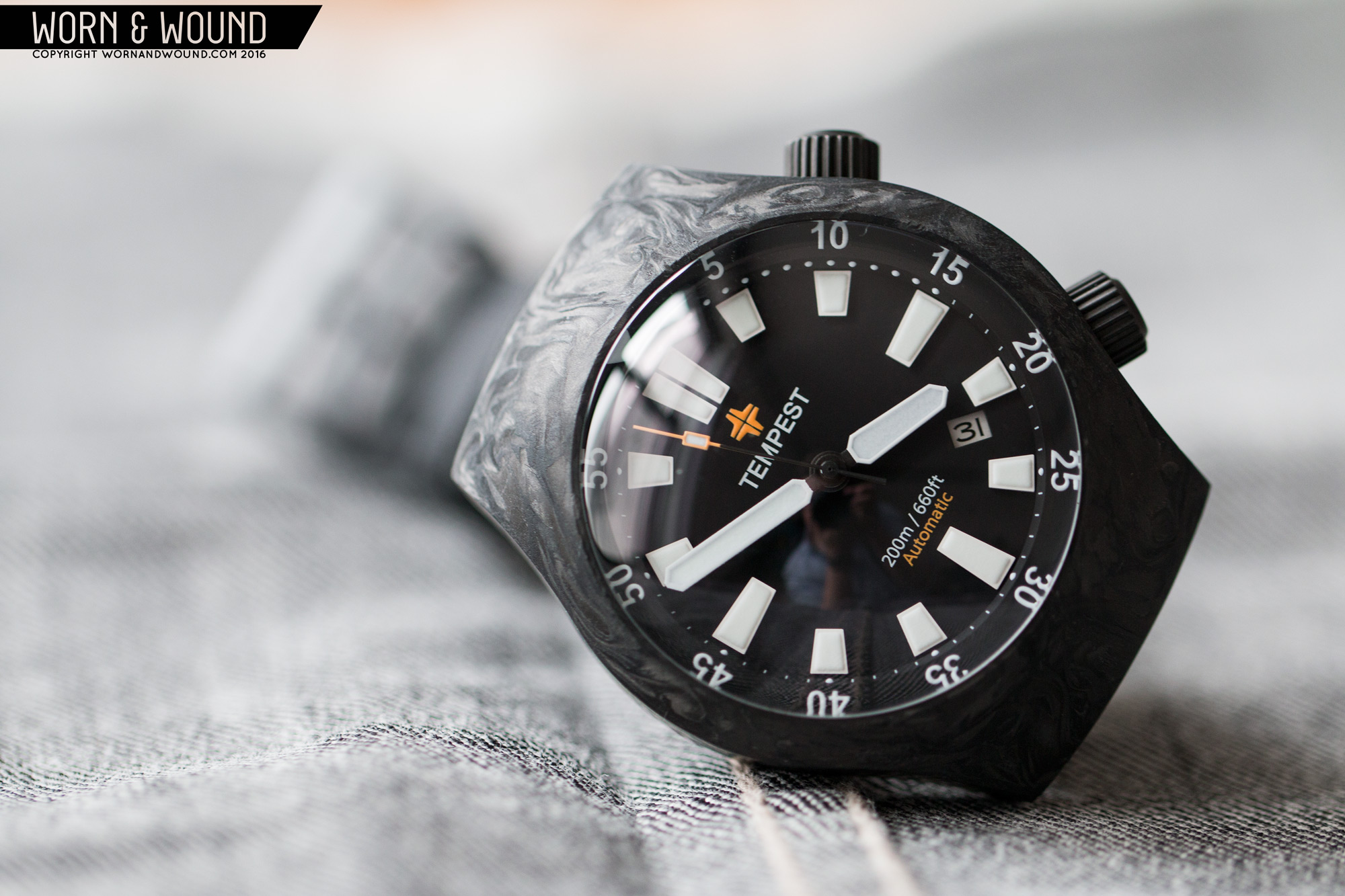
The Carbon 2 dial riffs on the previous model, taking its modern sport aesthetic into even bolder territory. The design is clever for an internal bezel model. The bezel doesn’t feel like a different component than the surface below, creating one cohesive design. The lower surface is matte black and contains a single index of massive applied markers for each hour. The markers are thick, white, tapering rectangles, each with a heavy slab of lume on top. They are truly huge, pushing the limits of how big they could be, but they work beautifully. They are bold, aggressive and simply unmissable.
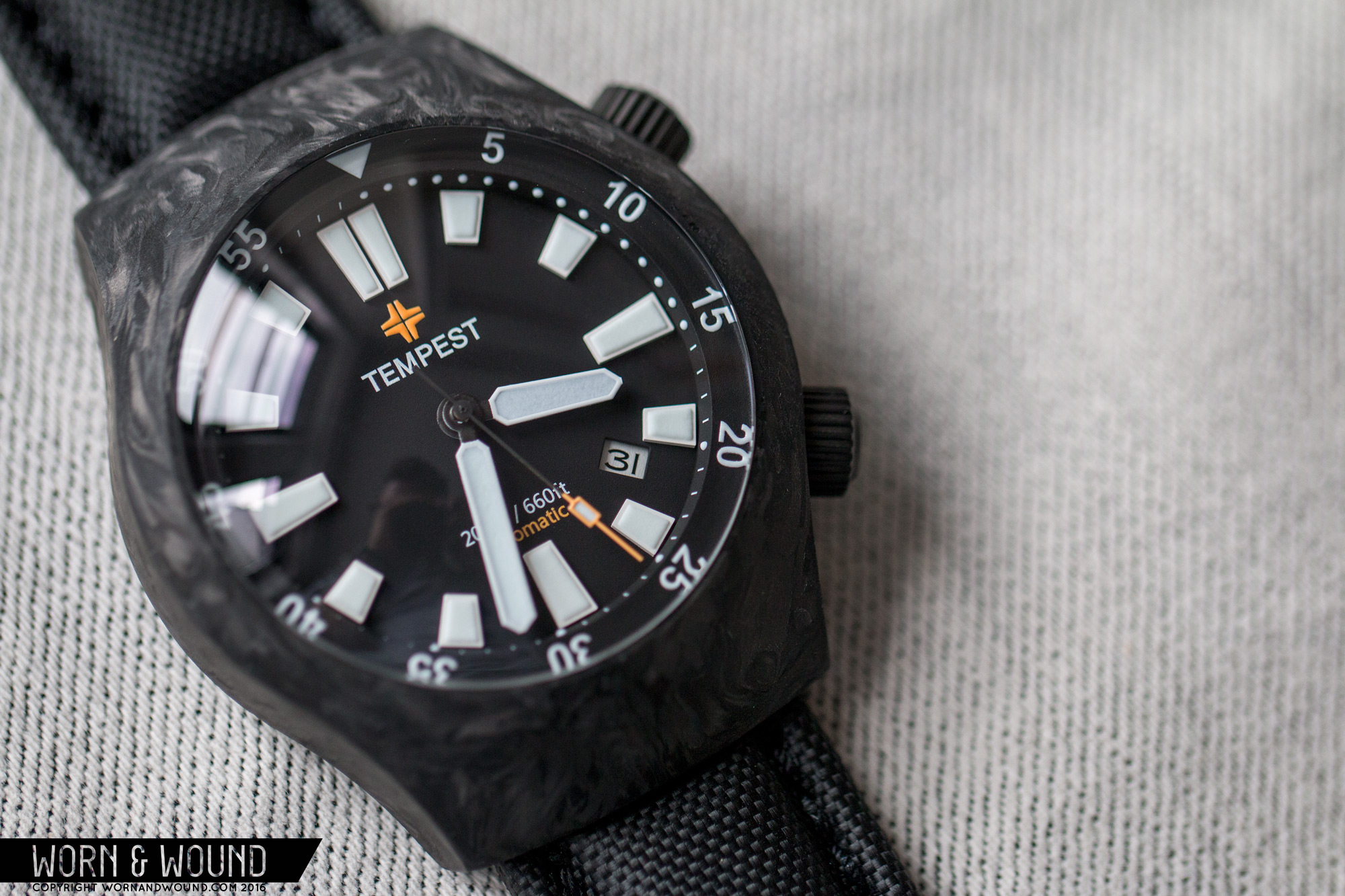
The internal bezel steps up a layer, but unlike most is flat, parallel to the surface below. The top surface features a minute/seconds index with numerals in white every 5 units and a small triangle at 12. The wall of the incline is slightly angled, allowing for it to be used for an index as well. Here you have a play off of a diver’s bezel index. The first 15 minutes is depicted with each minute being a lume dome. After 15, you have domes every 5 minutes, with white lines in between. It’s subtle, just giving the first 15 minutes a bit more boldness, though in the dark, they also all glow.
Also on the lower surface is a Tempest logo below 12, 200m / 660ft and automatic above 6 and a date window just off of four. The Tempest logo consists of the word-mark in white, and their symbol logo in bright orange. It’s sizable, but I happen to like how it looks. The orange is a nice break from the otherwise stark dial and case. The text at 6 is small, with the WR rating in white and automatic in orange as well. The date is a bit less successful. The placement feels odd as it’s closer to four than five, and doesn’t really correspond with the size and shape of the markers.
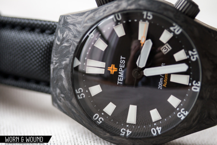
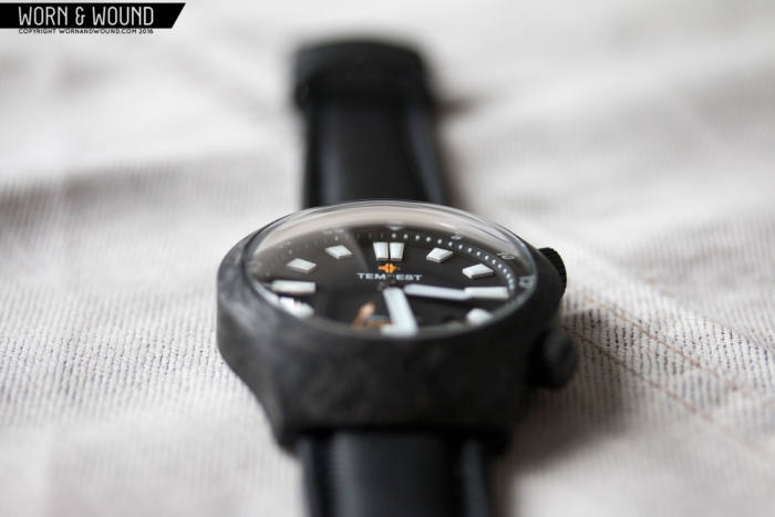
There is a lot of depth and texture to the dial, thanks to the layers and thick applied markers, but that is all emphasized by the giant domed sapphire, which is double domed for clarity. At oblique angles, you really feel like you are looking into an environment. The crystal is so far from the markers, that it gives everything more dimensionality. I found myself looking at the edges of the markers, and how the hands hover over everything. It’s a great design detail that I think they could push even further.
For the hands, they kept the same oversized paddle/swords from the first Carbon, with the distinct difference of keeping the minute hand white rather than orange. They work very well with the design, playing off of the extremely bold and blocky markers of the primary index. The seconds hand changes a bit, this time being a mostly black stick that becomes bright orange towards its end, with a lumed rectangle just before it ends as well. This watch is extremely legible at all times. In the dark, the markers, hands, domes and numerals on the bezel all glow blue thanks to a healthy amount of BGW9 lume, which looks great.
Straps and Wearability
The Carbon 2 comes mounted to the same or similar 22mm waterproof nylon, two piece strap as the Carbon 1. It’s built like a heavy duty leather strap, with padding and edge stitching but features black nylon across its top surface, with black leather for lining. This time, there is the addition of quick release spring bars. The strap works well with the watch. The texture of the nylon plays off the texture of the carbon, increasing the tactical feel of the watch overall.
On the wrist, the Carbon 2 is chunky, but not uncomfortable. It’s a big watch, especially in height, though much of that comes from the crystal. That said, the sides of the watch are tall and uninterrupted, adding to the sense of the watches height. The diameter at 42.5 is tolerable on my 7” wrist, giving the watch a lot of presence. The 50mm lug to lug is pushing it, but because of how the case curves, they sort of flow down your wrist, rather than hang over. For people who like a larger, but not huge watch, it will be fine, and for those with bigger wrists as well.
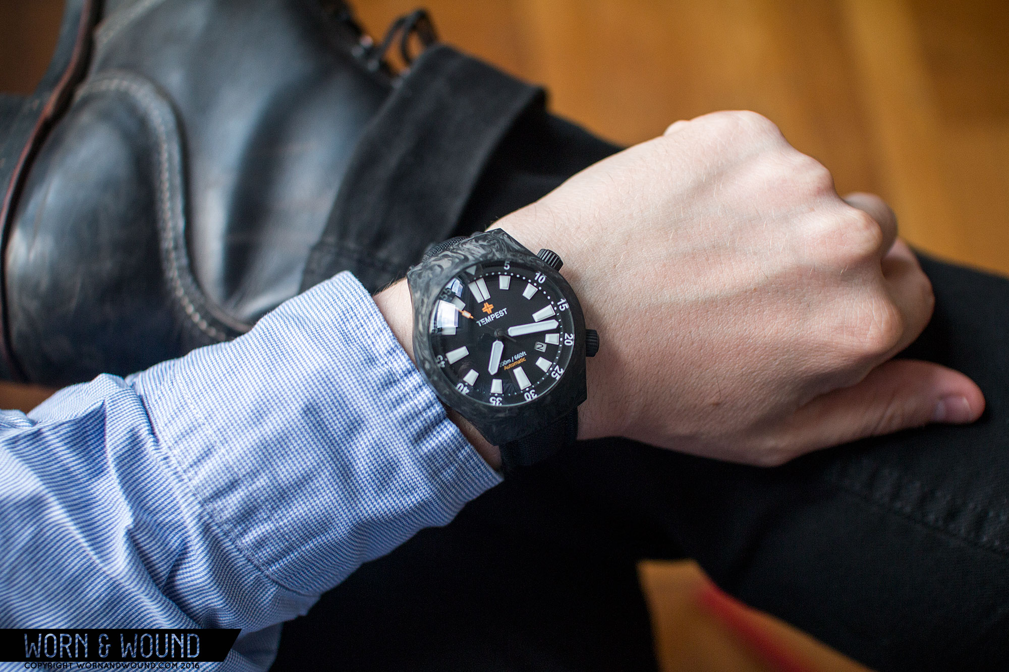
Regardless, it’s a great and crazy looking watch, unlike anything else I’ve worn. The Carbon 1 even was a far more normal watch when on the wrist. This thing is alien and bizarre, but somehow still stylish. While Speedmasters might be associated with Space exploration, they were designed for activities on the ground. This seems like it was designed for activities in deep space. It’s big, glossy eye looking out at you, while the sleek and exotic materials in use seem impervious to the unknown. On Earth, it’s just a gnarly looking sport watch. Thoroughly modern and unique, it looks great with casual, sporty and rugged attire.
Case
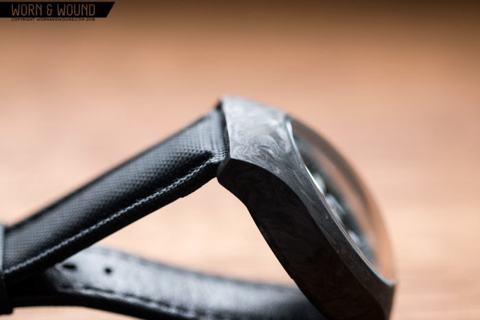
Well, to state the obvious, the case is made of “forged” carbon fiber. Dark, swirling, lightweight and smooth to the touch, the carbon has a presence unlike other materials. It’s exotic and tactical, giving the watch a distinctly modern feel. It’s not like PVD or ceramic, but is a nice alternative to both for a black watch. The design of the Carbon 2 has a retro-future feel to it, mixing a vintage-inspired case shape with a super-domed sapphire and the texture of carbon.
It’s a hooded-lug barrel with very clean lines and flowing surfaces. They did away with the faux bezel of the first, instead going for a mono-block look. Measuring 42.5 x 50.75 x 17.4mm (to the top of the super-domed crystal) it’s a rugged medium/large, staying in the same range as the previous model. The beauty of the curvature of the case is not to be understated. The top surface is ever flowing in smooth continuous lines that seamlessly transition in to crystal. And this is a hell of a crystal, rising up around 5mm from the case edge. It’s sleek and space-age, creating a micro-environment within the dial.
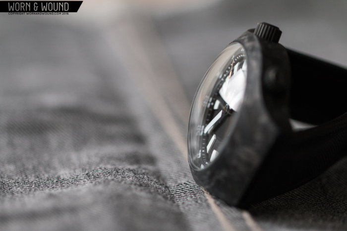
A new addition to the Carbon 2 is that of an internal bezel. Sporting the classic 2 and 4 crown arrangement, the internal bezel is operated from the unsigned crown at 2, while the time is operated by the signed crown at 4. The internal bezel crown doesn’t screw down, which I was a bit surprised by, though the watch still does sport a 200m water resistance. That action on the the bezel is stiff and smooth. It’s bi-directional and non-ratcheting, but there’s enough resistance within that accidental turning is unlikely. The crowns themselves are made of PVD steel and measure 7 x 4mm, making them fairly large an easy to grasp.
The Carbon 2 features a PVD steel case back that is held on with 6 screws. The back has the same art as the Carbon 1, which is a clever use of the carbon symbol from the periodic table with a few details about the watch around it. The clean, minimal execution is true to the brand.
Conclusion
Surprisingly, the Carbon 2 is actually only a little more than the original, which is great to see. The internal bezel and super domed crystal certainly add value to the already very interesting package. For those looking for a unique sport watch, this should be one to consider.
The Carbon 2 isn’t an evolution on the first, it’s a sequel to it. They took the plot points that worked on the first and exaggerated them, creating a more refined concept and then threw in a twist with the internal bezel. The result, Carbon Harder, is variation on the theme that has become more of its own, unique creation.

